


Being responsible for your brand’s media app content and digital activities is continuously becoming more demanding. Audience behavior trends show that people are streaming content across many devices - whenever and wherever they choose. This could include, for example, audiences that start viewing their favorite content on a smartphone app, and then finish watching them on a connected TV. Keeping them engaged and coming back for more content is a never-ending battle against other media brands for their attention.
One of the most significant media app development challenges, however, is balancing the conventions of individual platforms with the consistency of branding, functionality, and your premium content strategy. Without this balance, your app might feel completely misguided and out of place.
You must make sure that your app UX/UI works both cross-platform and across multiple devices. Marketers are clearly taking notice of these trends, with 74% of marketers saying that matching customers across multiple devices is one of their top priorities.
Developing a successful, engaging media app is crucial to your brands success, and it can easily be done by avoiding these 5 common media app UX mistakes:
1. Lack of white space
At a time when we’re being bombarded by information, it’s more important than ever to be clear with your app’s designs. A good design should always be readable, easy to understand, and able to get an audience’s attention.
This is where white space comes into play. White space doesn’t literally mean an empty space with a white background – it’s simply unmarked space in a design, such as the space between layouts and other elements.
Designing for TV, for example, requires a disciplined understanding of UX principles, as many TV apps on the market don’t know how to properly utilize white space and often create a lack of ‘breathing room’ for users’ eyes.
When considering white space, it’s important therefore to remember that ‘less is more’. You don’t need to fill all your space with content; it’s ok to leave some white space/unused real estate as well.
One important thing to keep in mind is the 10-foot rule – a rule designed to accommodate a typical television viewing distance of 10 feet. The goal of this design is to make the user's interaction as simple and efficient as possible, while still having an intuitive layout that helps accomplish user goals. More empty space between elements avoids having items blend into each other from a distance.
2. Filling the interface to the edges
When designing media apps, elements that are positioned too closely to viewport edges or corners can sometimes be clipped by a display’s rounded corners. It’s important to prevent critical information from getting clipped in the corners or covered by sensor housing. This ‘safe area’ is what ensures appropriate context, and helps keep UI elements within the always-visible portion of a user’s screen.
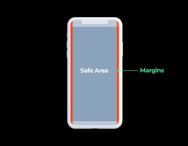
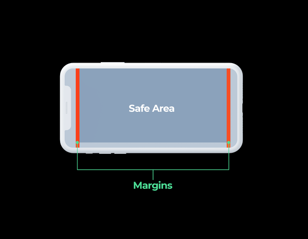
When it comes to safe zones, the important thing to keep in mind is to allow a certain margin percentage into your app designs. The focused item and on-screen text, especially, should be entirely within the inner percentage (the safe zone) of your app’s user interface.
3. Not making the interface intuitive for users
Your user interface is a space where different elements communicate and affect each other. That interaction creates a certain experience for the visitor, and your job is to ensure that this experience is as seamless as possible.
Elements such as color, size, and fill should all let your users know which screen element they’re going to be interacting with at all times.
When you fail to take these things into consideration, your interface is not intuitive, and users become frustrated and may even abandon your app altogether. In fact, according to Fortune, more than 75% of users open an app once and never come back.
Always understand how and when your users interact with your app, make sure they know what will happen at all times, and avoid clutter and irrelevant information.
4. Not considering interface readability
Attention to detail doesn’t only come in the form of user interaction. Aesthetics count as well. The most popular media apps have typically been those with vivid graphics, rich visuals, and seamless access to content. You could even have live streams play upon users opening your media app, which will help to immediately engage users with your content.
This type of ‘visual design’ attracts and engages users by strategically implementing colors, images, fonts, and other design elements.
Using small fonts, low contrast, or clashing colors – on the other hand - all have a negative effect on interface readability.
5. Not testing thoroughly
Understanding how users interact with your media app is crucial to crafting the best possible user experience. Special attention should therefore always be paid to ensure that your app is tested completely and is as bug-free as possible before being released.
Before your development phase even starts, try prototyping so that you can get a better idea of what your end product will be like. This process will help facilitate user testing and gather important feedback so that you can confidently identify any potential flaws in your app.
A winning UX interface is at hand
Creating a great UX interface is possible with the right strategy and approach. Designing for TV apps in particular requires a unique set of considerations, including taking into account screen size and viewer distance, context of use, and technical constraints.
To help avoid the media app UX mistakes discussed above, be sure your designers fully understand the design principles for all screen sizes and have experience creating such designs. You can also use a platform for app development that provides customizable templates. Doing so will allow you to be sure that these media design principles will be followed to a T.
An overall strategy of following the standards and conventions set above will help your design shine, and ultimately win over your users and keep them coming back for more.
If you liked this post, you might be interested in our article about app audience behavior
________________________________________________________________________


